Canva has been doing wonders with their new Design School and providing teaching materials people can use hands-on. Typography is quite effective with business materials such as your website, newsletters, and social media graphics. It all makes a difference in providing that good emotional feel. Think about it… when you see Apple products do you think they pair fonts willy-nilly without any type of strategic plan? Believe it or not, typography makes you feel a certain way. You can like, love, hate, or BUY with just the look of a typeface.
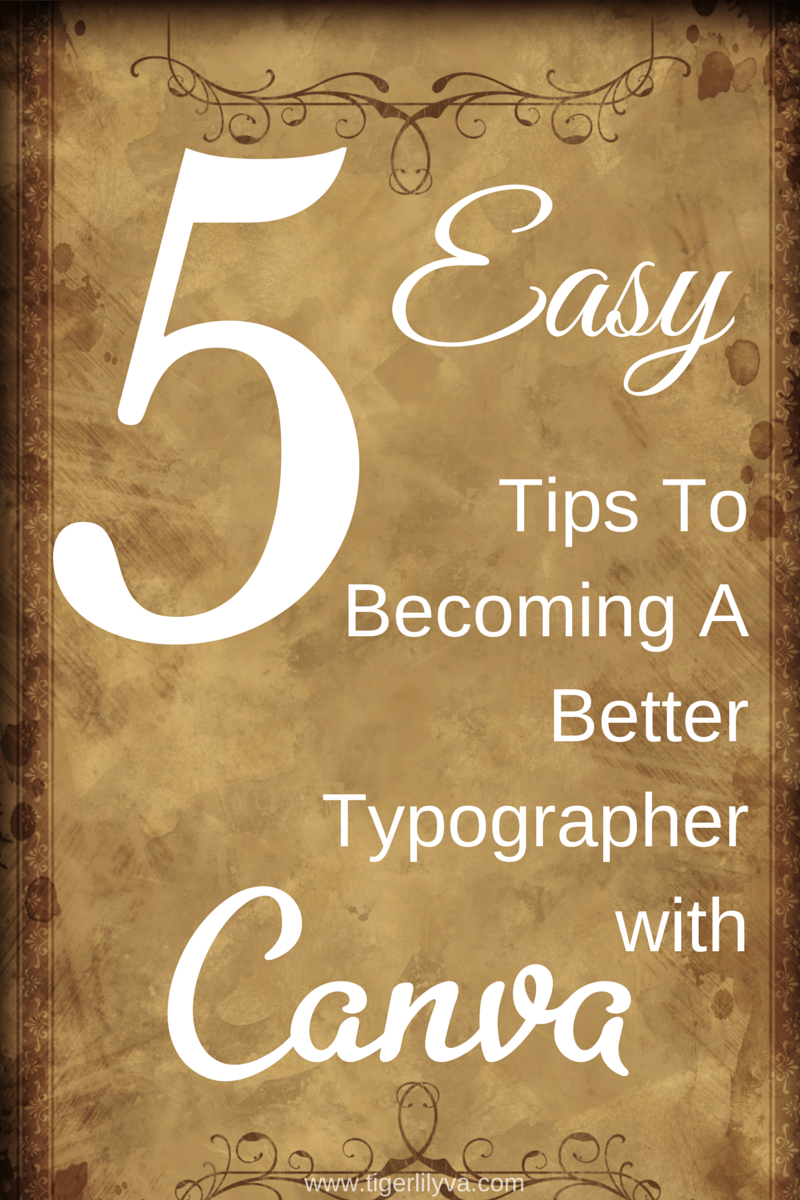
I did receive a lot of questions about typography from my last post, Why is Typography Important for Business, which is why I feel that these 5 EASY tips in becoming a better typographer with Canva would help detail the importance and provide better assistance on your graphic efforts.
Here are 5 easy tips to creating a better typographer in YOU:
For the light background with objects right smack dab in the middle –
 No matter what you’re going to use the photo for… the flowers or the food, you have a small amount of white/light background to use.
Here’s how to take advantage of a small amount of working space:
- Add Free Form Text

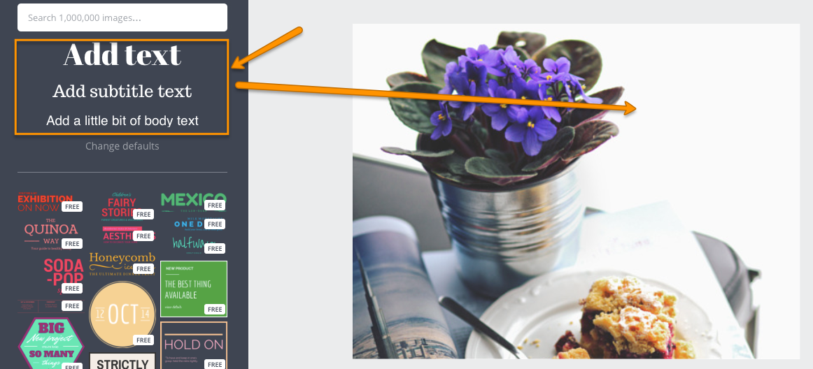
When you add free form text then you have the freedom to increase and decrease the size as you’d like. Using the ready-made text shapes that Canva provide can be constraining and won’t provide the look you want for sentences.
- Be cautious with the size and font that you choose for an image.

The size on this font called Creepster is way too large. The white open space is what should be used. It’s a pretty nature photo so why would you hide the beauty. Use a font such as: Alike, Raleway, Helvetica, or Aileron for positive or “feel good” messages.
- Take advantage of blank spaces or use a text shape on the dark image.
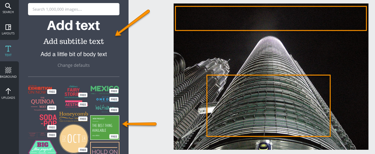
Sure you can use the limited space on the very top of the photo but what if the text is a bit long. Use a square and add text on top of it (not the ready-made text shape).
- Use a typeface to enhance a textured background or emphasize a phrase.

Changing one of the words for emphasis by changing the font to a script or cursive font can make all the difference. Using a serif font can enhance the textured background and bring the image together.
- Use Text Spacing or Kerning to add emphasis
In Canva, they call kerning Text Spacing and you can find it in the arrow drop-down when you click on the text. You can minimize or maximize your letter spacing or your line height for dramatic effect.

These 5 EASY tips will make you a better typographer in whatever graphic you create. – Tweet this!
Check out the SlideShare on the 5 Easy Tips!
Now it’s your turn… show me whatcha got. Go to Canva and create an image using any of these tips. Click on the Share button after you’re done creating and copy/paste the link in the comments. I’d love to see your typographical skills.
Until next time!
Take care,
Lillian De Jesus

Hi Lillian,
I enjoyed this post because I use Canva a lot. I use it for my blog pictures and also social sharing. I like the part about using those blank spaces to add text…you have given me some excellent pointers here and I so appreciate it.
-Dona
Hi Donna,
I’m so glad you enjoyed this post! I’ve got some more pointers coming shortly for intermediate Canva users. Stay tuned!
Take care,
Lillian